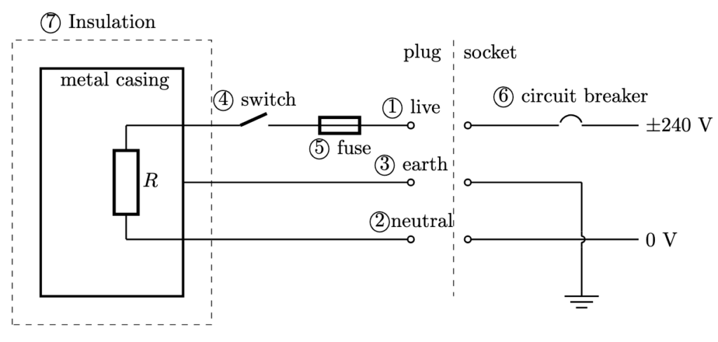
IP Topics

Interactive Heating and Cooling Curves

Heating and cooling curves are graphical representations that show how the temperature of a substance changes as heat is added or removed over time. They illustrate the behavior of substances as they go through different states—solid, liquid, and gas.

Heating Curve: This curve shows how the temperature of a substance increases as it absorbs heat. The curve typically rises as the substance heats up, with plateaus indicating phase changes, where the substance absorbs energy but its temperature remains constant. Check out the heating curves for water and nitrogen using the drop-down menu.

Cooling Curve: This curve is the opposite of the heating curve. It shows how the temperature decreases as the substance loses heat. Like the heating curve, it also has plateaus where phase changes occur, but this time, the substance releases energy. In addition to water, you can also see the cooling curve for ethanol.

With these ChatGPT-generated interactive graphs, users can change the rate of heat input or released from the substance. They can also read the descriptions that explain the changes in the average PE and KE of the molecules during each process.

Geiger–Müller counter simulation

A Geiger-Muller (GM) counter is an instrument for detecting and measuring ionizing radiation. It operates by using a Geiger-Muller tube filled with gas, which becomes ionized when radiation passes through it. This ionization produces an electrical pulse that is counted and displayed, allowing users to determine the presence and intensity of radiation.

Svjo-2, CC BY-SA 3.0, via Wikimedia Commons

This simulation (find it at https://physicstjc.github.io/sls/gm-counter) allows students to explore the random nature of radiation and the significance of accounting for background radiation in experiments. Here’s a guide to help students investigate these concepts using the simulation.

Exploring Background Radiation

Q1: Set the source to “Background” and start the count. Observe the count for a few minutes. What do you notice about the counts recorded?

A1: The counts recorded are relatively low and vary randomly. This reflects the background radiation which is always present.


Q2: Why is it important to measure background radiation before testing other sources?

A2: Measuring background radiation is important to establish a baseline level of radiation. This helps in accurately identifying and quantifying the additional radiation from other sources.


Investigating a Banana as a Radiation Source

Q3: Change the source to “Banana” and reset the data. Start the count and observe the readings. How do the counts from the banana compare to the background radiation?

A3: The counts from the banana are higher than the background radiation. This is because bananas contain a small amount of radioactive potassium-40.


Q4: How do the counts per minute (CPM) for the banana vary over time? Is there a pattern or do the counts appear random?

A4: The counts per minute for the banana vary over time and appear random, reflecting the stochastic nature of radioactive decay.


Exploring a Cesium-137 Source

Q5: Set the source to “Cesium-137” and reset the data. Start the count and observe the readings. How do the counts from Cesium-137 compare to both the background radiation and the banana?

A5: The counts from Cesium-137 are significantly higher than both the background radiation and the banana. This is because Cesium-137 is a much stronger radioactive source.


Q6: What do the counts per minute (CPM) tell you about the intensity of the Cesium-137 source compared to the other sources?

A6: The CPM for Cesium-137 is much higher, indicating a higher intensity of radiation compared to the background and banana sources.


Understanding the Random Nature of Radiation

Q7: By looking at the sample counts, can you predict the next count value? Why or why not?

A7: No, you cannot predict the next count value because radioactive decay is a random process. Each decay event is independent of the previous ones.


Q8: How can you use the background radiation measurement to correct the readings from the banana and Cesium-137 sources?

A8: You can subtract the average background CPM from the CPM of the banana and Cesium-137 sources to get the corrected readings, isolating the radiation from the specific sources.


Graphical Representation of Waves

Use the quiz below to test your ability to interpret graphs of waves. You can click on a point in the map to read the values.

The codes for this quiz are generated by AI. However, the options and correct answers are rule-based and as such, should not have any errors.

It is able to randomly select from 4 different questions for displacement-distance graphs and 4 others for displacement-time graphs, while randomising the values of amplitude, wavelength and period.

Interactive Graph with Javascript

I was experimenting with using generative AI to create an interactive graph that could be used to amend the animation of a moving particle, for the topic of kinematics. Students are able to move the four points on the velocity time graph to manipulate the movement. I kept the graph to straight lines between each point to keep things simple.

The vertical axis toggles between displacement and velocity. This will be yet another way for students to learn about how the velocity-time graph affects motion. I have found that many students are confused between displacement and velocity. The app’s ability for them to vary the velocity graph and then make predictions of the resulting displacement graph and the movement should be worth the effort.

Heat capacity and an AI-generated simulation on thermal transfer

This Javascript app will be used in the coming weeks for my IP4 class to demonstrate the effect of heat capacity on the equilibrium temperature of two bodies in thermal contact. When two objects with different temperatures come into contact, heat flows from the hotter object to the cooler one until thermal equilibrium is reached. The heat capacity, which is the amount of heat required to change the temperature of an object per unit change in temperature, plays a crucial role in determining the final equilibrium temperature. Objects with higher heat capacities can absorb more heat without a significant change in temperature, while those with lower heat capacities experience larger temperature changes for the same amount of heat absorbed or released. Thus, the final equilibrium temperature is closer to the initial temperature of the object with the higher heat capacity.

For example, consider a small piece of metal and a large body of water initially at different temperatures. When placed in thermal contact, the metal, with its lower heat capacity, will quickly change temperature as it transfers heat to or absorbs heat from the water. Meanwhile, the water, with its much higher heat capacity, will undergo a relatively smaller temperature change. As a result, the equilibrium temperature will be much closer to the initial temperature of the water.

Prompts given to ChatGPT 4o to create this simulation:

  1. Make a javascript simulation showing transfer of heat energy from one body to another. Put all the codes in one file.
  2. Show it in a canvas with a height of 100 px and width of 580 px. The first body is hot at first, represented by a red colour body. The second body is cold, represented by blue. The colour of the body should be a function of the temperature. If the temperatures of the two bodies are the same, they should have the same temperature.
  3. Use a bold arrow to show the direction of heat transfer.
  4. Using plotly.js, create a graph below the canvas that shows the variation of temperature for each body (using red and blue lines) with time.
  5. Initialise the graph such that the time axis starts at zero and ends at 5 seconds.
  6. Create sliders that can change the heat capacity of each object with a range from 20 to 200 J per degree celsius.