Teaching Resources

Physics teaching resources

Graph Plotting App made with ChatGPT in 15 minutes

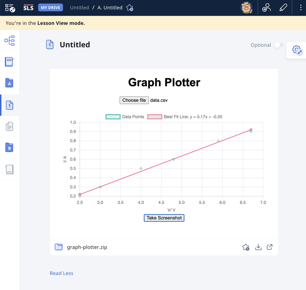
As evidence of the prowess of generative AI, this graph plotting app was created in about 15 minutes with simple prompts and a text editor. It was tested with an existing set of data and uploaded immediately to the repository.

The user will begin by uploading a set of data from an experiment, with the column header being the labels for the axes, in the form of a CSV file. The app immediately calculates and displays the best-fit straight line using linear regression, providing users with insights into the relationships between the variables in the dataset. This allows for easy analysis of trends, patterns, and relationships within the data. Students can use the app to quickly visualize and analyze data. The screenshot button enables them to save the graph in picture form for submission to their teachers.

It has also been made compatible with the Student Learning Space. The screenshots saved by students can be uploaded as an attachment for a free-response question. This is especially useful when students are doing lab work and the teacher does not want the students to bother too much with configuring the graph. The ZIP file for use in the SLS can be downloaded here.

Prompts used are:

  1. Create a website using html and javascript for users to plot a graph using data from a csv file.
  2. The user can upload a csv file with the first column being the horizontal axis and the second column being the vertical axis.
  3. The column headers, which is the first set of values in the csv file, will form the labels for the axes of the graph.
  4. Plot the points with the data in the csv file and use linear regression to obtain the best-fit straight line of the data.
  5. The best fit line should be a line joining two red dots.
  6. Indicate the gradient and intercept of the best-fit line.
  7. Add a button at the bottom for users to take a screenshot of the graph.
  8. Put all the codes in one html file.

Dice Simulation to Teach Probability

A dice simulation is an excellent tool for teaching probability because it provides a hands-on, visual way for students to understand the concepts of probability through experimentation and observation.

In the simplest demonstration, students should be able to predict and observe that a fair six-sided dice gives equal probability of outcome and hence, almost equal total occurrences given a large-enough sample size.

Students can then be asked to predict the probability distribution if given two dice.

The good thing is that with simulations, students get to compare the experimental probabilities they calculated with the theoretical probabilities and discuss any discrepancies and reasons for them. This allows students to understand the concept of randomness and how experimental results may vary from theoretical expectations due to chance.

Click here to access the simulator and here to download it for SLS.

The prompts used for ChatGPT are as follow:

Provide the code for the following in a single html file:

  1. Create a 6-sided dice simulator where the user can click on the image of a dice, the dice image will change randomly and the final result will be shown on the image.
  2. The dice image will be represented by the file “dice1.png” for the number 1, “dice2.png” for number 2, “dice3.png” for number 3 and so on. The image size is 80 pixels by 80 pixels.
  3. The default setting shows one dice. The initial image shown is “dice1.png”.
  4. Create a button to cast the dice.
  5. Create a bar chart with 6 vertical columns at the bottom that shows the frequency of the numbers obtained by the dice. Adjust the bar chart to show all 6 possible outcomes.
  6. Each time the dice is cast and the result is shown, it is added to a list shown below the chart.
  7. Create a button for an option to toggle between the use of one dice or two die. When this button is clicked, the list of results and the bar chart is cleared. The initial images shown are both “dice1.png”. If two die are used, both die will be shown side by side.
  8. Both die will be cast when clicking on either dice. The bar chart now shows the frequency of the total of the numbers obtained by the die. Adjust the bar chart such that it now has 12 vertical columns show all 12 possible outcomes.
  9. The total number for each toss will be shown in the list.

Creating Learning Apps Using ChatGPT

Simulating an Oscillation

Despite learning some time ago that ChatGPT can help with coding, I had not had the chance to test it out. Since I had a pocket of time available to explore last week, I keyed in the following prompt:

“Create a simulation of an oscillating particle moving from left to right with simple harmonic motion with a slider to control the period of oscillation using javascript, html and css.”

I then cut and pasted the code in its entirety into a html file and this is the output:

https://physicslens.github.io/shm/

This is what it looks like, in case you do not want to click into the link above.

Of course, more work needs to be done to improve the usability but I believe some of that can be done using ChatGPT as well. A basic knowledge of the programming language will certainly help to refine the user interface or add new functions.

Extending the oscillation to include 100 particles each with a constant phase difference, we can simulate a wave :

https://physicslens.github.io/shm/oscillator3.html

Simluation of oscillation with variable period

For the second simulation, I used the following prompt:

“Create a simulation of particles moving horizontally with simple harmonic motion. The simulation should display 100 particles arranged vertically, each oscillating horizontally at a different phase. The horizontal motion of the particles should simulate simple harmonic motion, with their positions following a sine wave pattern. The amplitude of oscillation should be set to 100 pixels, and the period of oscillation should be controlled by a slider input with a range from 0.1 to 2 seconds. The particles should be confined within a container with a fixed width of 600 pixels and a height of 400 pixels. The slider input should be positioned at the bottom of the container. The simulation should update the positions of the particles at regular intervals to create the illusion of continuous motion.”

Flashcards

Next, I tried creating an webpage that allows students to practise recalling definitions of specific terms that are obtained from a csv file. This is the prompt I gave:

“Create a revision webpage using html, javascript and css that references a csv file in the same folder with three columns: “topic”, “term” and “definition”. There should be a filter for the “topic” field. Each term in the “term” field will be displayed in turn using a left and right button. Another button labelled “Definition” will be used to show or hide the corresponding “definition” field at the bottom. Put all the script and style codes in the html file.”

At first, the button to display the definitions did not appear as ChatGPT misunderstood my instructions.

After making some adjustments, this is the link to the functioning site:

https://physicslens.github.io/definitions/

and this is the refined html file:

All you have to do is to update the csv file with the topics, terms and definitions and ensure the index file is in the same folder as the data.csv file.

The best part for Singaporean teachers is, the zip file can be uploaded as a file into SLS and students can use it to test their recall of key terms.

Conclusion

The rise of generative AI is indeed creating new opportunities for learning, even for teachers. What used to require long hours of learning can now be condensed into a session with ChatGPT. We will still need to give very specific instructions which require some basic understanding of the product. At the same time, we need to be able to make tweaks here and there, but that should be easier since we have the basic structure of the product already.

Simulation of a Bouncing Ball

While I have shared a simulation of a bouncing ball made using Glowscript before, I felt that one made using GeoGebra is necessary for a more comprehensive library.

It took a while due to the need to adjust the equations used based on the position of the graphs, but here it is: https://www.geogebra.org/m/dfb53dps

The kinematics of a bouncing ball can be explained by considering the dynamics and forces involved in its motion. In this simulation, air resistance is assumed negligible. When a ball is dropped from a certain height and bounces off the ground, several key principles of physics come into play. Let’s break down the process step by step:

Free Fall: When the ball is released, it enters a state of free fall. During free fall, the only force acting on the ball is gravity. This force is directed downward and can be described by W = mg

W is the gravitational force.
m is the mass of the ball.
g is the acceleration due to gravity (approximately 9.81 m/s² near the surface of the Earth).

Impact with the Ground and Bounce: When the ball reaches the ground, it experiences a force due to the collision with the surface. This force is an example of a contact force and much larger than the gravitational force. This force depends on the elasticity of the ball and the surface it bounces off.

During the collision with the ground, the ball’s momentum changes rapidly. If the ball and the ground are both ideal elastic materials, the ball will bounce back with the same speed it had just before impact. In reality, some energy is lost during the collision, causing the bounce to be less than perfectly elastic. This simulation assumes elastic collisions.

Post-Bounce Motion: After the bounce, the ball starts moving upward. Gravity acts on it as it ascends, decelerating its motion until it reaches its peak height.

Second Descent: The ball then starts descending again, experiencing the force of gravity pulling it back down towards the ground.

This process continues with each bounce. In practice, with each bounce, some energy is lost due to the non-ideal nature of the collision and other dissipative forces like air resistance. As a result, each bounce is typically lower than the previous one until the ball eventually comes to rest. However, for simplicity, the simulation assumes no energy is lost during the collision and to dissipative forces.

An animated gif file is included here for use in powerpoint slides:

LOL Diagram Template using GeoGebra

Direct link: https://www.geogebra.org/m/u2m3gnzj

The above is a GeoGebra applet that can be customised for any energy problem. Simply make a copy of it and change the values or labels as needed. This can be integrated into either GeoGebra Classroom or Google Classroom (as a GeoGebra assignment) and the teacher can then monitor every student’s attempt at interpreting the energy changes in the problem. The teacher can also choose different extents of scaffolding, e.g. provide the initial or final states and ask students to fill in the rest.

What is an LOL Diagram?

An LOL diagram is a tool used to visualize and analyze the conservation of energy in physical systems. “LOL” does not stand for anything meaningful. Rather, they just form the shapes of the two sets of axes and the circle in between. They help clarify which objects or components are included in the energy system being considered and how energy is transferred or transformed within that system.

In LOL diagrams:

  • An energy system is defined as an object or a collection of objects whose energies are being tracked.
  • LOL diagrams consist of three parts: a L-shaped bar-chart representing the initial state, an O representing the object (or system) of interest and another L-shaped bar-chart representing the final state.
  • There can also be energy transferred into the system or out of the system if the system is not closed or isolated. These are represented using horizontal bars below the L axes, with arrows indicating if they are energy transferred in or out.

When performing calculations involving the initial and final energy states, the energy transferred into the system is added to the initial energy state while the energy transferred out of the system is added to the final energy state. The sums must be equal. In other words,

Initial energy stores + Energy transferred into system = Final energy stores + Energy transferred out of system

How do I use an LOL diagram?

Here’s a breakdown of how LOL diagrams are used, using an example of a falling mass:

  1. System Definition (O):
    • Choose what is part of the energy system (objects whose energies are being tracked) and what isn’t.
    • For example, in the case of a falling mass, the mass itself and the Earth are part of the energy system.
  2. Initial State (L):
    • Represent the initial energy configuration of the system.
    • Identify the types of energy present in the system at the beginning. In this example, we begin with some gravitational potential energy.
  3. Transition:
    • Show how energy changes as the system evolves. In the falling mass example, the gravitational potential energy decreases, and kinetic energy increases.
  4. Final State (L):
    • Represent the energy distribution in the system at the end of the process.
    • In the falling mass example, at the point just before it hits the ground, kinetic energy is maximized, and gravitational potential energy is minimized.

LOL diagrams illustrate that energy within the system is conserved, meaning the total energy in the system remains constant.

External work (work done by forces outside the defined system) may impact the system’s energy, but internal work (work done within the defined system) does not change the total energy of the system.

The mathematical representation of the above problem will then simply be:

GPE = KE

$mgh = \dfrac{1}{2}mv^2$

This problem seems a bit trivial. Since LOL diagrams are a visual tool to help students and scientists analyze energy transformations and conservation, they can be used for making it easier to set up and solve conservation of energy equations in problems of greater complexity.

LOL Diagram of an Electrical Circuit

It is also important to note that the choice of the object (or system) of interest will result in different LOL diagrams for the same phenomenon.

For example, consider a filament bulb in a circuit with a battery. The system at room temperature also has some energy in the internal store (or internal energy, which consists of the kinetic and potential energies of the particles in the system).

When considering the filament as the object of interest, when energy is transferred electrically from the battery, part of it is transferred by light from the bulb to the surroundings and another part is added to the internal store, as it heats up the filament light.

On the other hand, when considering the circuit as the whole, the chemical potential store of the battery is included in the initial energy state of the system. Hence, there is no additional energy transfer into the system but the energy transfer output is still the same.

How do I modify the GeoGebra applet to make my own LOL Diagram?

Here’s a video that demonstrates how the editing process is done, in a little more than one minute!

The final product is here.