Click on the canvas to place the body at your desired location.
Label the Body.
Add Forces:
Click the “Add Force” button.
Click on two bodies that exert the force on each other.
Label the Force.
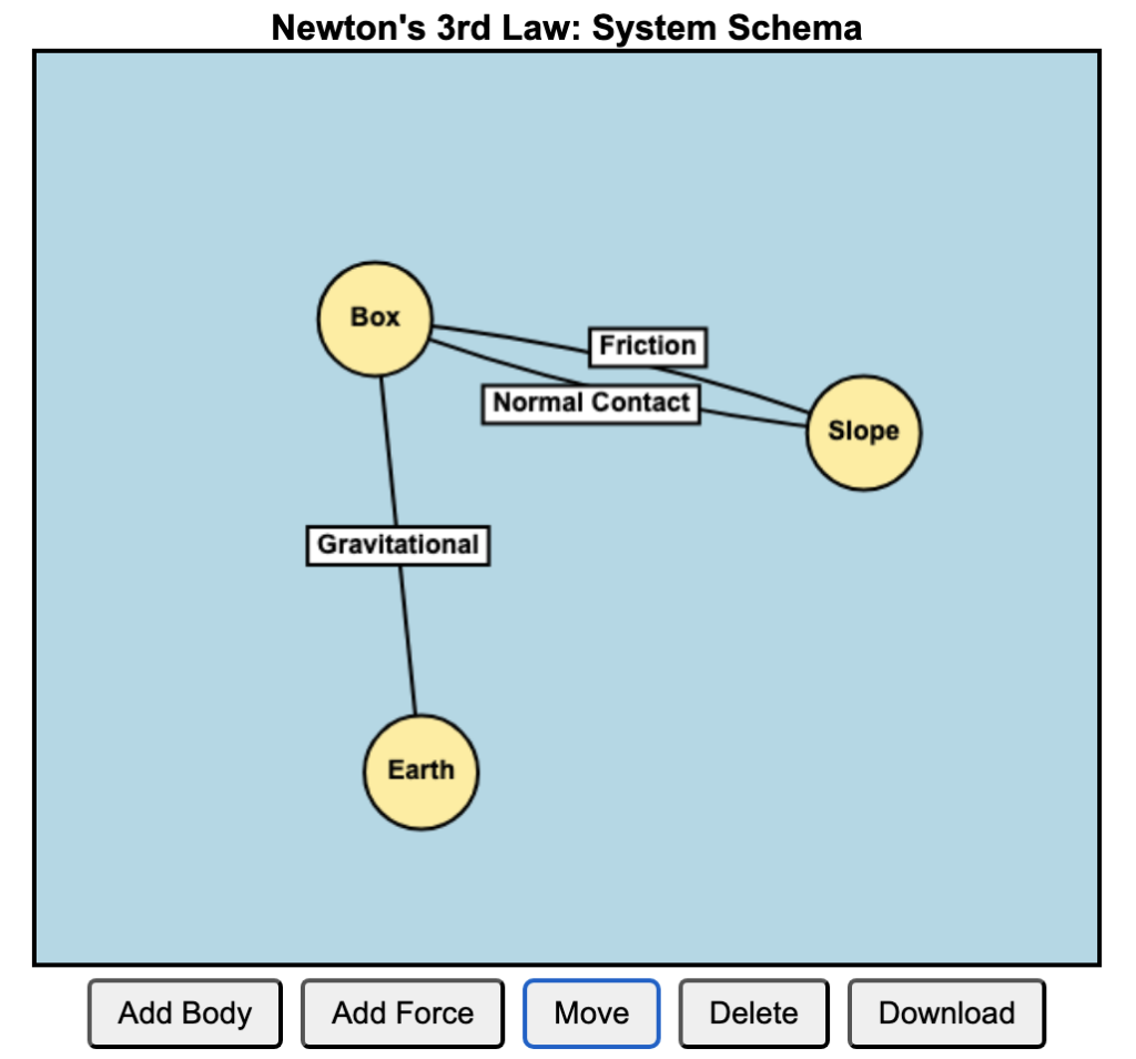
Using System Schema to Understand Newton’s Third Law
Newton’s Third Law states that when Body A exerts a force on Body B, Body B exerts an equal and opposite force on Body A. While this principle is conceptually simple, many students struggle to apply it consistently across different physical scenarios. The System Schema approach provides a powerful way to visualise and analyse these interactions. It is a representation tool developed by The Modeling Instruction program at Arizona State University (Hinrichs, 2004).
A system schema is a diagram that represents objects (as circles) and interactions (as lines) between them. Instead of focusing on individual forces, a system schema helps students see the relationships between objects before applying force diagrams. This method emphasizes Newton’s Third Law by explicitly showing how forces come in pairs between interacting objects.
To correctly identify action-reaction force pairs, consider the following guidelines:
Forces Act on Different Objects: Each force in the pair acts on a different object. For example, if Body A exerts a force on Body B, then Body B simultaneously exerts an equal and opposite force on Body A.
Forces Are Equal in Magnitude and Opposite in Direction: The magnitudes of the two forces are identical, but their directions are opposite.
Forces Are of the Same Type: Both forces in the pair are of the same nature, such as gravitational, electromagnetic, or contact forces.
The steps to applying System Schema to Newton’s Third Law are as follow:
Identify the bodies in the system – Draw each object as a separate circle.
Represent interactions – Draw lines between bodies to indicate forces they exert on each other (e.g., a box on the ground interacts with Earth through gravitational force).
Label force pairs – Each interaction represents an action-reaction force pair (e.g., a hand pushes a wall; the wall pushes back).
By mapping forces this way, students can easily recognize that forces always act between bodies and in pairs, reinforcing the symmetry of Newton’s Third Law.
One of the most common misconceptions of students is that normal contact force and gravitational force acting on a body are action-reaction pairs because they are equal and opposite in a non-accelerating system. By using the system schema, they can see that the two forces involve interaction with different bodies, e.g. the floor of an elevator for normal contact force, and the Earth for gravitational force.
Understanding motion in physics often involves analyzing displacement, velocity, and acceleration graphs. With the interactive GeoGebra graph at this link, you can dynamically explore how these concepts are connected.
How It Works
This interactive simulation lets you visualize an object’s motion and its corresponding displacement-time, velocity-time, and acceleration-time graphs. You can interact with the model in two key ways:
Adjust Initial Conditions:
Move the dots on the graph to change the starting displacement, velocity, or acceleration.
Observe how these changes influence the overall motion of the object.
Use the Slider to Animate Motion:
Slide through time to see how the object moves along its path.
Watch the displacement vector, velocity vector, and acceleration vector update in real time.
Key Observations
When displacement changes, the velocity and acceleration graphs adjust accordingly.
A constant acceleration results in a straight-line velocity graph and a quadratic displacement graph.
Negative acceleration (deceleration) slows the object down and can cause direction reversals.
If velocity is constant, the displacement graph is linear, and acceleration remains at zero.
Why This is Useful
This GeoGebra tool is perfect for students and educators looking to build intuition about kinematics. Instead of just solving equations, you get a visual and hands-on way to see the relationships between these key motion variables.
Try it out yourself and experiment with different conditions to deepen your understanding of motion!
This deck of slides are the ones I will be using for the Symposium on “Leveraging Technology for Engaging and Effective Learning” at the Singapore International Science Teachers’ Conference (SISTC) 2024 on Day 2 of the Conference (20 November). Feel free to download for your reference.
In recent years, AI tools like DALL-E and MidJourney have gained popularity for generating stunning, artistic images. However, when it comes to creating scientific illustrations, particularly for exams, we need accuracy, clarity, and precision. This is where LaTeX, a document preparation system widely used in academia, shines. Combined with the intelligence of ChatGPT, LaTeX can produce exactly the images you need without the artistic flair or ambiguity that tools like DALL-E might introduce.
The process of generating science exam images using ChatGPT and LaTeX is straightforward:
Describe the Diagram: You begin by providing a detailed description of the diagram or scientific illustration you need. For example, “Generate a diagram using Latex showing a free-body diagram of a block on an inclined plane with friction.”
ChatGPT Generates LaTeX Code: Based on your description, ChatGPT can generate the appropriate LaTeX code, using packages like TikZ or PGFPlots to create the required scientific diagram. The output might look like this: \documentclass{standalone} \usepackage{tikz} \begin{document} \begin{tikzpicture} % Inclined plane \draw[thick] (0,0) -- (4,2); \draw[thick] (0,0) -- (4,0); % Block \draw[fill=gray] (2,1) rectangle (2.5,1.5); % Forces \draw[->,thick] (2.25,1.25) -- (2.25,2.25) node[above] {Normal Force}; \draw[->,thick] (2.25,1.25) -- (2.25,0.25) node[below] {Weight}; \draw[->,thick] (2.25,1.25) -- (3.25,1.25) node[right] {Friction}; \end{tikzpicture} \end{document}
Compile the LaTeX Code: Once the code is generated, you can compile it using any LaTeX editor (such as Overleaf or a local LaTeX distribution).
Check for Errors: The diagram is unlikely to look perfect in the first iteration. For example, the above code gives the following:
Edit: You can either instruct ChatGPT to modify specific sections of the diagram or make the changes yourself. After 3 more iterations, for example, ChatGPT produced the following codes: \begin{tikzpicture} % Inclined plane \draw[thick] (0,0) -- (4,2); \draw[thick] (0,0) -- (4,0); % Block (rotated to match the slope) \draw[fill=gray, rotate around={26.565:(2.25,1.25)}] (2,1) rectangle (2.5,1.5); % Forces (adjusted for friction up the slope) % Normal Force (perpendicular to the slope) \draw[->,thick] (2.25,1.25) -- ++(-0.447,0.894) node[above left] {Normal Force}; % Weight (straight down) \draw[->,thick] (2.25,1.25) -- (2.25,0.25) node[below] {Weight}; % Friction (along the slope, now pointing up the incline) \draw[->,thick] (2.25,1.25) -- ++(0.894,0.447) node[above right] {Friction}; \end{tikzpicture}
This is the output image:
Integrate into Teaching Materials: Once you are satisfied with the output, the compiled image can then be saved as a PDF, PNG, or any other image format and directly embedded into your exam materials.
The following are similar images made using the same workflow and their corresponding codes, which I made changes to manually instead as it was faster for me once I became familiar with the coordinate-system based drawing method.
The simulation below allows students to practise calculating potential differences and currents of a slightly complex circuit, involving three different modes that can be toggled by clicking on the switch.
When resistors and are connected in series, the total resistance is simply the sum of the individual resistances:
The current through the circuit is given by Ohm’s Law:
where is the total potential difference supplied by the source.
The potential difference across each resistor can be calculated using:
Mode 2: and in Parallel, in Series
In this mode, resistors and are in parallel, and is in series with the combination. First, calculate the equivalent resistance of the parallel combination:
Thus, the total resistance is:
The current through the circuit is:
The potential difference across is:
Since and are in parallel, they share the same potential difference:
The current through each parallel resistor can be found using Ohm’s Law:
Mode 3: and in Series, in Parallel
Here, resistors and are connected in series, and the combination is in parallel with . First, calculate the resistance of the series combination:
Then, find the total resistance of the parallel combination:
The total current is:
The voltage across the parallel combination is the same for both branches:
The current through is:
The current through and , which are in series, is the same:
I modified an existing simulation to demonstrate how the displacement of particles along a longitudinal wave can be represented in graphical form.
Essentially, one would have to determine for each particle, its displacement from the equilibrium position and its corresponding position along the wave’s direction. On the graph, positive displacement indicates movement in one direction (e.g., to the right), while negative displacement indicates movement in the opposite direction (e.g., to the left).