GeoGebra

Pressure Nodes and Antinodes

Access in full screen here: https://www.geogebra.org/m/xbknrstt

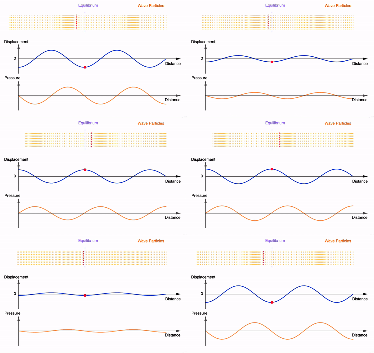
I modified the progressive sound wave interactive into a stationary wave version.

This allows students to visualise the movement of particles about a displacement node to understand why pressure antinodes are found there.

Usually I will pose this question to students: where would a microphone pick up the loudest sound in a stationary sound wave? Invariantly, students will say it is at the antinode. When asked to clarify if it is the displacement antinode or pressure antinode, students then become uncertain.

According to Young & Geller (2007), College Physics 8th Edition, Pearson Education Inc. (pg 385), microphones and similar devices usually sense pressure variations and not displacements. In other words, the position within a stationary sound wave at which the loudest sound is picked up is at the displacement nodes which are the pressure antinodes.

For an alternative animation, check out Daniel Russell’s.

For embedding into SLS, please use the following code:

<iframe scrolling="no" title="Stationary Sound Wave (Displacement and Pressure)" src="https://www.geogebra.org/material/iframe/id/xbknrstt/width/640/height/480/border/888888/sfsb/true/smb/false/stb/false/stbh/false/ai/false/asb/false/sri/false/rc/false/ld/false/sdz/true/ctl/false" width="640px" height="480px" style="border:0px;"> </iframe>
This animation gif file demonstrates the movement of particles in a stationary sound wave, displaying the changing displacement-distance and pressure-distance graphs simultaneously. It can be inserted into slides and websites. Free to use!

AC Power with Half-Wave Rectification

As a means of visualising what happens to the potential difference, current and power dissipated in an alternating current circuit with half-wave rectification, I have created the interactive applet with all 3 graphs next to each other.

It should be easy for students to see that with half-wave rectification, the power dissipated is half that of a normal a.c. supply with the same peak p.d. and current.

Root-mean-square Currents

The concept of root-mean-square values for Alternating Currents is challenging if students are to relate the I-t graph with the Irms value directly.

They have to be brought through the 3 steps before arriving at the Irms value. This interactive applet allows them to go through step by step and compare several graphs at one time to see the relationship.

Through the interaction, students might be asked to observe that the Irms value is never higher than the peak Io.

For a complete sinusoidal current:

For a diode-rectified current:

In comparing the Irms of both currents, students can be asked to consider why the ratio of the values is not 2:1 or any other value, from energy considerations.

Worked on this earlier as I am the lead lecturer for this JC2 topic and am trying to integrate useful elements of blended learning. Do let me know in the comments if you have ideas or feedback that you would like to share.

Simple harmonic motion graphs including energy

I have added two more graphs into the interactive animation. However, the app has become a bit sluggish when changing the period or amplitude. It still works smoothly when viewing the animation.

Students ought to find it useful to look at all the graphs together instead of in silo. This way, they can better understand the relationships between the graphs.

Here is an animated gif for use on powerpoint slides etc.

simple harmonic motion graphs

Simple Harmonic Motion Graphs

Here’s my attempt at animating 5 graphs for simple harmonic motion together in one page.

From left column:

$$v = \pm\omega\sqrt{x_o^2-x^2}$$

$$a = -\omega^2x$$

From right column:

$$s = x_o\sin(\omega t)$$

$$v = x_o\omega \cos(\omega t)$$

$$a = -x_o\omega^2 \sin(\omega t)$$

And here is the animated gif file for powerpoint users:

Simple harmonic motion graphs - displacement-, velocity-, acceleration- time graphs and more