This GeoGebra applet was modified from an existing applet to show the relationship between the pressure-distance and displacement-distance graph of a progressive longitudinal wave.
This is a 3D printed Pythagorean cup, otherwise known as a greedy cup, where if one pours far too much water or wine or whatever your greedy heart desires, all the contents in the cup will leak out through the bottom.
This is based on the design by “jsteuben” on Thingiverse (https://www.thingiverse.com/thing:123252). The siphoning effect kicks in when the water level is above the internal “tube” printed and hidden into the walls of the cup.
I printed another cup based on a more conventional design as well, but due to the wrong settings given when I prepared the gcode file, the cup was rather leaky when the water level was low. This design by “MonzaMakers” has a protruding siphon tube. (https://www.thingiverse.com/thing:562790)
Explaining how the siphon works is easier with the second cup. When the water level is lower than the highest point in the siphoning tube, it remains in the cup. When it exceeds the highest point of the tube, water begins to flow down the part of the tube leading to the opening at the bottom of the cup. The falling water column creates a suction effect and continuously draws the rest of the water in, until the cup is dry.
After setting up my newest toy, the Creality Ender 3 V2 3D Printer, I started with a few simple prints from the Thingiverse website. The first Physics-related object created is for a colleague – a tippe top. This interesting mushroom-shaped toy is spun with the round top facing down. If it is spun fast enough, it will eventually spin upright, in the opposite orientation to where it started spinning. In doing so, it’s centre of mass even shifted upwards.
The source of the STL file is: https://www.thingiverse.com/thing:536377
The following video gives an explanation for why this happens.
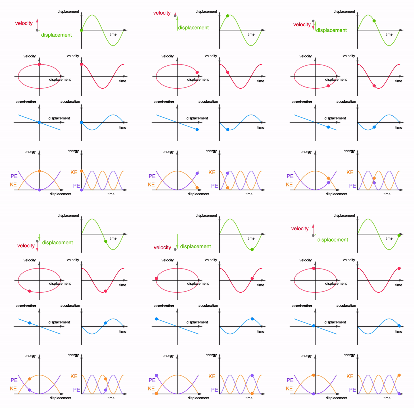
I have added two more graphs into the interactive animation. However, the app has become a bit sluggish when changing the period or amplitude. It still works smoothly when viewing the animation.
Students ought to find it useful to look at all the graphs together instead of in silo. This way, they can better understand the relationships between the graphs.
Here is an animated gif for use on powerpoint slides etc.
Here’s my attempt at animating 5 graphs for simple harmonic motion together in one page.
From left column:
$$v = \pm\omega\sqrt{x_o^2-x^2}$$
$$a = -\omega^2x$$
From right column:
$$s = x_o\sin(\omega t)$$
$$v = x_o\omega \cos(\omega t)$$
$$a = -x_o\omega^2 \sin(\omega t)$$
And here is the animated gif file for powerpoint users: