Technology

Customised GPT to answer primary school science questions using CER approach

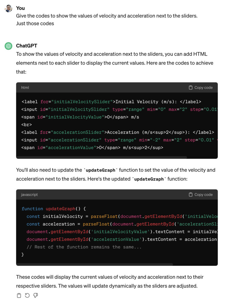
I recently subscribed to OpenAI’s GPT4 and started customising GPTs to help break down answers to a question using strategies such as the Claim-Evidence-Reasoning approach.

The prompt given to GPT-4 was this:

Break down the response to a user's question using the following framework:

Claim:
A claim is a statement that answers the question. It will usually only be one sentence in length. The claim does not include any explanation, reasoning, or evidence so it should not include any transition words such as “because.”

Evidence:
The evidence is the data used to support the claim. It can be either quantitative or qualitive depending on the question and/or lab. The evidence could even be a data table the student creates. Students should only use data within their evidence that directly supports the claim.

Reasoning:
The reasoning is the explanation of “why and how” the evidence supports the claim. It should include an explanation of the underlying science concept that produced the evidence or data.

Pitch the answer at the 12th grade level using British English. In each stage of C-E-R, give a very short response in bold and give a brief elaboration if necessary in normal font. Do not use concepts that are outside of the syllabus.

Do not discuss anything beyond the question asked so as to protect the safety of the young user. Reject the question by asking the user to stay within the syllabus. While doing this, there is no need to stick to the C-E-R framework.

Express each main point within 15 words to make it succinct.

I also uploaded the PSLE Primary Science syllabus document for the GPT to retrieve to augment its responses.

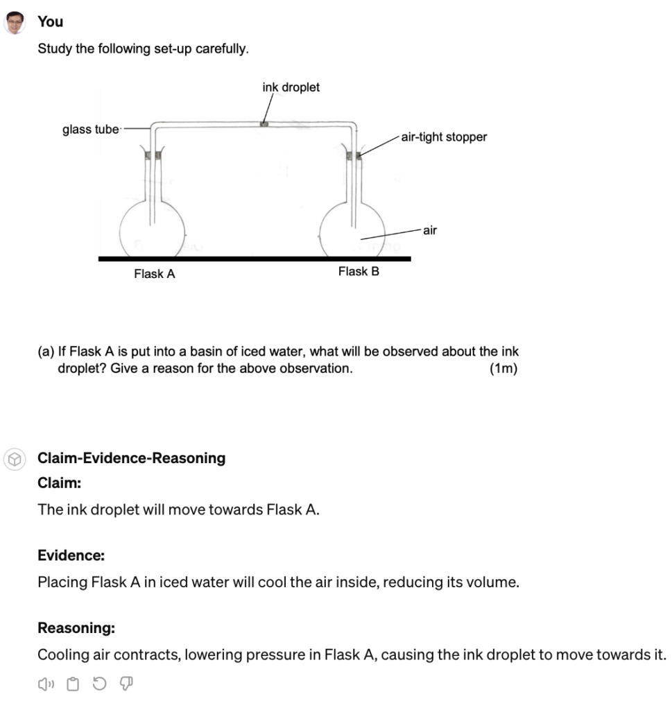
This is the answer given of a PSLE-related question. The reasoning is sound and should be given the full mark.

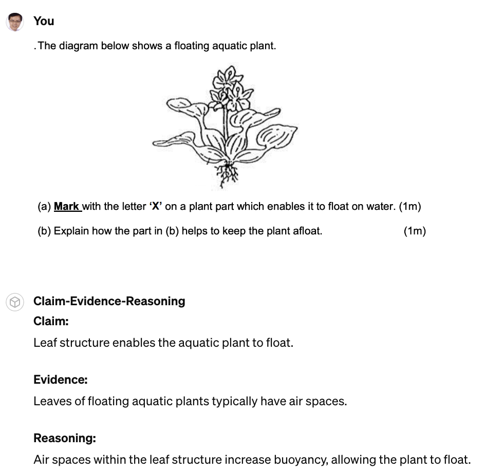
The question itself had a typographical error but that did not deter the AI from giving the right responses. Part (b) of this problem was answered clearly and should be awarded the mark.

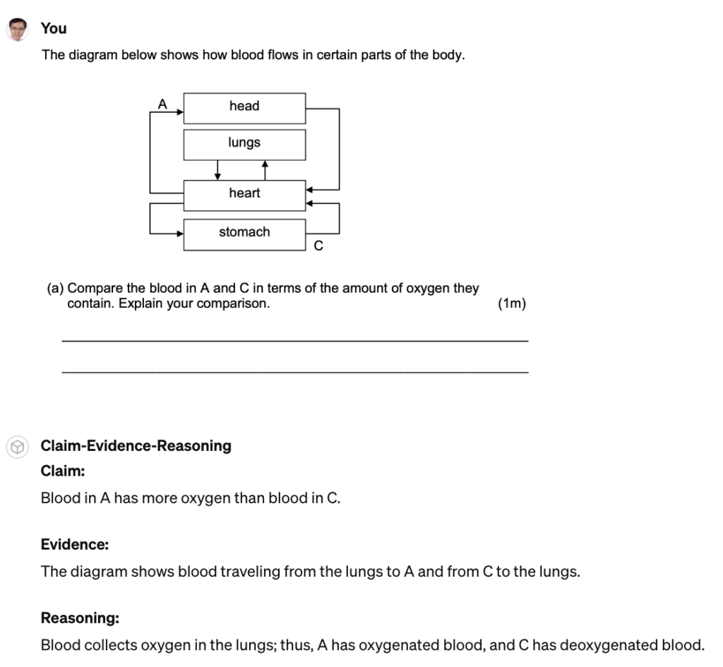
This next one was a little problematic. While the claim given is correct, the evidence stated suggested that the blood travelled directly from the lungs to A, without mention of the heart. However, it does have some merit. It was already pretty amazing that the AI was able to infer from the flow chart whether oxygen exists in the blood or not.

This GPT-4 model is deployable via Poe.com but only via the paid subscription account. I also tried creating a similar bot for free using Schoolai to see if they could do the same but it could not process images. The same goes for the free versions of Claude and ChatGPT in Poe.com.

Customising Google Gemini

I managed to find one customisable GPT that can process images namely Gemini in Poe.com. I fed it the same prompt and document for its reference. There is a limit to the number of questions you can ask for free, by the way, but it is good for experimentation.

There are some inaccuracies that present a cause for concern. As an anecdote, this example generated using Gemini contradicts the response given by ChatGPT and is wrong.

Question 2 was not too bad though. This time, it did not bother to express the answers in the CER structure.

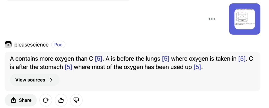
It seems Question 3 is indeed challenging due to the need to interpret a vague flowchart. Just as it did for GPT-4, it caused Gemini to stumble too, when it wrongly stated that A is before the lungs.

Non-customisable GPTs

Microsoft’s Copilot can process questions in image form for free and give comparable answers as well. However, we are not able to customise the GPT beforehand to give age-appropriate responses and in accordance with the local syllabus, or limit the scope of the student’s interaction with the bot, so as to prevent distraction.

Generating Standalone Web Apps for SLS using ChatGPT 3.5

The video tutorial is out!

The tutorial documents the iterations that were made to create a game where users guess a prime number based on hints given. It also demonstrates how the codes can be pasted into a text editor such as Wordpad (for Windows – which most Singapore teachers use) and TextEdit (for Mac) in order to create a html file. The file could then be zipped and uploaded into the Singapore Student Learning Space.

In addition to that, as I will be conducting a sharing which includes a hands-on session to help some other teachers try it out on their own, I also got ChatGPT to create a website that can convert the codes into an html file without the need for the installation of any code editor.

Stationary Wave Interactive using ChatGPT

I wanted to challenge ChatGPT to produce a complex interactive in order to prove that it is possible for teachers without much programming background to work with it as well.

This time, it was a lot more trial and error. The first major problem was when I thought the usual javascript library for graphs, Chart.JS would work. However, what I produced as a wonky wave in both directions that somehow attenuated as it travelled even though the equation of the waves did not have a decay factor.

The equation was generated by ChatGPT but looked like a normal sinusoidal function to me:

var y1 = Math.sin(2 * Math.PI * x / wavelength - 2 * Math.PI * time / period);

This is what the wonky graph looks like:

My suspicion is that Chart.JS makes use of points to form the curve so animating so many points at one go put too much demand on the app.

I then asked ChatGPT to suggest a different library. It then proceeded to make a new app with Plotly.JS, which works much better with moving graphs. This impressed me. I am learning so much with this new workflow. The final interactive graph can be found here:

I decided to add more functions after the first page was ready. While it took me about an hour to get the first page right with about 15 iterations mainly due to the wrong javascript library used, adding in more sliders to make the interactive more complex with variable wavelengths, periods and amplitudes took less than 10 minutes.

I shall just share the prompts that were given after I realised that plotly.js is the way to go.

Prompts for the index page:

  1. Create a graph using plotly.js with a vertical axis for displacement of wave particles and a horizontal axis for distance moved by a wave. .
  2. Draw the curve of an infinitely long transverse wave moving along the horizontal axis.
  3. Create another infinitely long transverse wave of the same wavelength moving in the opposite direction along the same horizontal axis. Represent them in different colours.
  4. Use a slider to change the period of oscillation of both waves and another slider to change the wavelength of the waves.
  5. Each wave should have the same wavelength.
  6. Revised prompt: Keep the vertical axis fixed in height, equal to the maximum possible amplitude of the third wave.
  7. Revised prompt: Keeep the legend of the chart to the bottom so that the horizontal axis length is fixed at 640 pixels

Prompts for the second page:

  1. Have separate sliders for the amplitudes, periods and wavelengths of wave 1 and wave 2.
  2. Display the values of the sliders next to them.

Kinematics Graphs with Variable Initial Velocity and Acceleration

I used ChatGPT to create this simple interactive graph. Including the time taken to make 2 rounds of refinement using more prompts and the time it took to deploy it via Github, it took about 15 minutes from start to end.

The first prompt I used was :

Create a graph using chart.js with vertical axis being “displacement / m” and horizontal axis being “time / s”. There should be a slider for the initial velocity value ranging from 0 to 2 m/s, a slider for the acceleration value ranging from -2 m/s^2 to 2 m/s^2. The displacement will start from zero and will follow a function dependent on the initial velocity and acceleration values from the slider. Draw the line of the displacement on the graph. Update the graph whenever the sliders are moved.

The results of the first attempt is shown above. It is already functional, with the initial velocity and acceleration sliders working together to change the shape of the graph.

The function it used to calculate displacement is based on the kinematics equation $s = ut + \dfrac{1}{2}at^2$, written as

    displacement.push(0.5 * acceleration * t * t + initialVelocity * t);

After the first successful attempt, I gave some refinement prompts like:

Show the values of the velocity and acceleration, along with the units.

Use drop-down list to change the vertical axis to velocity or acceleration, updating the axis each time and the curve as well.

So the second attempt looked like this

ChatGPT got 1 out of 2 requests correct. The values of the velocity and acceleration were intended to be displayed next to the sliders. It must have been because I was not clear enough. Hence, the last refinement I asked for was :

Give the codes to show the values of velocity and acceleration next to the sliders. Just those codes.

I didn’t want to get ChatGPT to generate the entire page of html and javascript again so I targetted the specific codes that I needed to change.

It was helpful in telling me where to update these codes. So at the end of the day, this is what was obtained after I made some manual tweaks to change the way the unit is displayed (e.g. m s-2 instead of m/s2):

It was good enough for my purpose now. The web app can be sent to students as a link (https://physicstjc.github.io/sls/kinematics-graph) or embedded into SLS as a standalone app. For use in SLS, do note the following:

  1. The html file must be named index.html
  2. The chart.js file must be copied and saved in the same zipped file at the same level as the index.html file. Change the path of the Chart JS from <script src=”https://cdnjs.cloudflare.com/ajax/libs/Chart.js/3.7.0/chart.min.js”></script> to <script src=”chart.min.js”></script>.
  3. For reference, this is what it looks like when zipped.

Graph Plotting App made with ChatGPT in 15 minutes

As evidence of the prowess of generative AI, this graph plotting app was created in about 15 minutes with simple prompts and a text editor. It was tested with an existing set of data and uploaded immediately to the repository.

The user will begin by uploading a set of data from an experiment, with the column header being the labels for the axes, in the form of a CSV file. The app immediately calculates and displays the best-fit straight line using linear regression, providing users with insights into the relationships between the variables in the dataset. This allows for easy analysis of trends, patterns, and relationships within the data. Students can use the app to quickly visualize and analyze data. The screenshot button enables them to save the graph in picture form for submission to their teachers.

It has also been made compatible with the Student Learning Space. The screenshots saved by students can be uploaded as an attachment for a free-response question. This is especially useful when students are doing lab work and the teacher does not want the students to bother too much with configuring the graph. The ZIP file for use in the SLS can be downloaded here.

Prompts used are:

  1. Create a website using html and javascript for users to plot a graph using data from a csv file.
  2. The user can upload a csv file with the first column being the horizontal axis and the second column being the vertical axis.
  3. The column headers, which is the first set of values in the csv file, will form the labels for the axes of the graph.
  4. Plot the points with the data in the csv file and use linear regression to obtain the best-fit straight line of the data.
  5. The best fit line should be a line joining two red dots.
  6. Indicate the gradient and intercept of the best-fit line.
  7. Add a button at the bottom for users to take a screenshot of the graph.
  8. Put all the codes in one html file.