The tutorial documents the iterations that were made to create a game where users guess a prime number based on hints given. It also demonstrates how the codes can be pasted into a text editor such as Wordpad (for Windows – which most Singapore teachers use) and TextEdit (for Mac) in order to create a html file. The file could then be zipped and uploaded into the Singapore Student Learning Space.
In addition to that, as I will be conducting a sharing which includes a hands-on session to help some other teachers try it out on their own, I also got ChatGPT to create a website that can convert the codes into an html file without the need for the installation of any code editor.
I wanted to challenge ChatGPT to produce a complex interactive in order to prove that it is possible for teachers without much programming background to work with it as well.
This time, it was a lot more trial and error. The first major problem was when I thought the usual javascript library for graphs, Chart.JS would work. However, what I produced as a wonky wave in both directions that somehow attenuated as it travelled even though the equation of the waves did not have a decay factor.
The equation was generated by ChatGPT but looked like a normal sinusoidal function to me:
var y1 = Math.sin(2 * Math.PI * x / wavelength - 2 * Math.PI * time / period);
This is what the wonky graph looks like:
My suspicion is that Chart.JS makes use of points to form the curve so animating so many points at one go put too much demand on the app.
I then asked ChatGPT to suggest a different library. It then proceeded to make a new app with Plotly.JS, which works much better with moving graphs. This impressed me. I am learning so much with this new workflow. The final interactive graph can be found here:
I decided to add more functions after the first page was ready. While it took me about an hour to get the first page right with about 15 iterations mainly due to the wrong javascript library used, adding in more sliders to make the interactive more complex with variable wavelengths, periods and amplitudes took less than 10 minutes.
I shall just share the prompts that were given after I realised that plotly.js is the way to go.
Prompts for the index page:
Create a graph using plotly.js with a vertical axis for displacement of wave particles and a horizontal axis for distance moved by a wave. .
Draw the curve of an infinitely long transverse wave moving along the horizontal axis.
Create another infinitely long transverse wave of the same wavelength moving in the opposite direction along the same horizontal axis. Represent them in different colours.
Use a slider to change the period of oscillation of both waves and another slider to change the wavelength of the waves.
Each wave should have the same wavelength.
Revised prompt: Keep the vertical axis fixed in height, equal to the maximum possible amplitude of the third wave.
Revised prompt: Keeep the legend of the chart to the bottom so that the horizontal axis length is fixed at 640 pixels
Prompts for the second page:
Have separate sliders for the amplitudes, periods and wavelengths of wave 1 and wave 2.
I used ChatGPT to create this simple interactive graph. Including the time taken to make 2 rounds of refinement using more prompts and the time it took to deploy it via Github, it took about 15 minutes from start to end.
The first prompt I used was :
Create a graph using chart.js with vertical axis being “displacement / m” and horizontal axis being “time / s”. There should be a slider for the initial velocity value ranging from 0 to 2 m/s, a slider for the acceleration value ranging from -2 m/s^2 to 2 m/s^2. The displacement will start from zero and will follow a function dependent on the initial velocity and acceleration values from the slider. Draw the line of the displacement on the graph. Update the graph whenever the sliders are moved.
The results of the first attempt is shown above. It is already functional, with the initial velocity and acceleration sliders working together to change the shape of the graph.
The function it used to calculate displacement is based on the kinematics equation $s = ut + \dfrac{1}{2}at^2$, written as
displacement.push(0.5 * acceleration * t * t + initialVelocity * t);
After the first successful attempt, I gave some refinement prompts like:
Show the values of the velocity and acceleration, along with the units.
Use drop-down list to change the vertical axis to velocity or acceleration, updating the axis each time and the curve as well.
So the second attempt looked like this
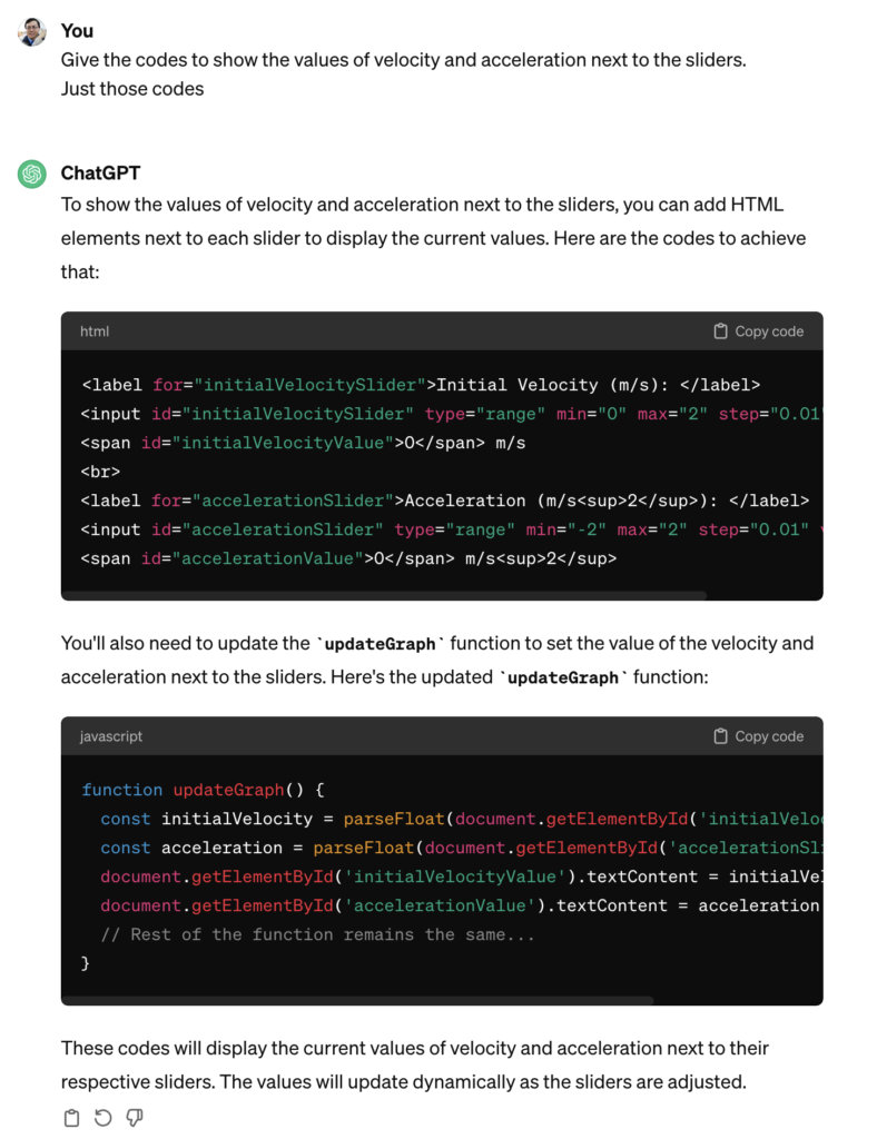
ChatGPT got 1 out of 2 requests correct. The values of the velocity and acceleration were intended to be displayed next to the sliders. It must have been because I was not clear enough. Hence, the last refinement I asked for was :
Give the codes to show the values of velocity and acceleration next to the sliders. Just those codes.
I didn’t want to get ChatGPT to generate the entire page of html and javascript again so I targetted the specific codes that I needed to change.
It was helpful in telling me where to update these codes. So at the end of the day, this is what was obtained after I made some manual tweaks to change the way the unit is displayed (e.g. m s-2 instead of m/s2):
It was good enough for my purpose now. The web app can be sent to students as a link (https://physicstjc.github.io/sls/kinematics-graph) or embedded into SLS as a standalone app. For use in SLS, do note the following:
The html file must be named index.html
The chart.js file must be copied and saved in the same zipped file at the same level as the index.html file. Change the path of the Chart JS from <script src=”https://cdnjs.cloudflare.com/ajax/libs/Chart.js/3.7.0/chart.min.js”></script> to <script src=”chart.min.js”></script>.
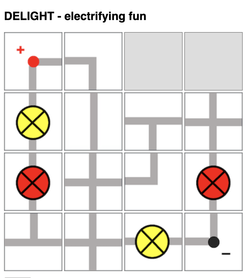
I had previously shared about this physical board game that I designed to teach electricity concepts. Now, with ChatGPT’s help, I have managed to produce a simple implementation of the board game so that there is no need to print and cut out the pieces anymore.
However, the game is still unable to detect if the light bulb will light up and automatically change the image colour or add the scores. That will require further complex programming due to the many possible outcomes for this game.
Players will take turns to connect their own bulbs to the terminals while trying to sabotage their opponent’s bulbs.
Players will take turns to place one piece on the 4-by-4 game board by clicking to select the electrical component and clicking on the square on the board to place it.
Upon placing the piece, the player can also turn that piece in any orientation (by clicking on it) within the same turn.
Players can choose to use up to two turns at any point in the game to rotate any piece that had been placed by any player.
In other words, each player has 9 turns: 7 placement turns and 2 rotation turns.
At lower levels, students can compete to see who has the most lit bulbs. However, they will need to be able to identify which light bulbs are lit. Do watch out for short-circuits.
At higher levels, students can compete to see whose light bulbs has the most total electrical power, with some calculations involved.
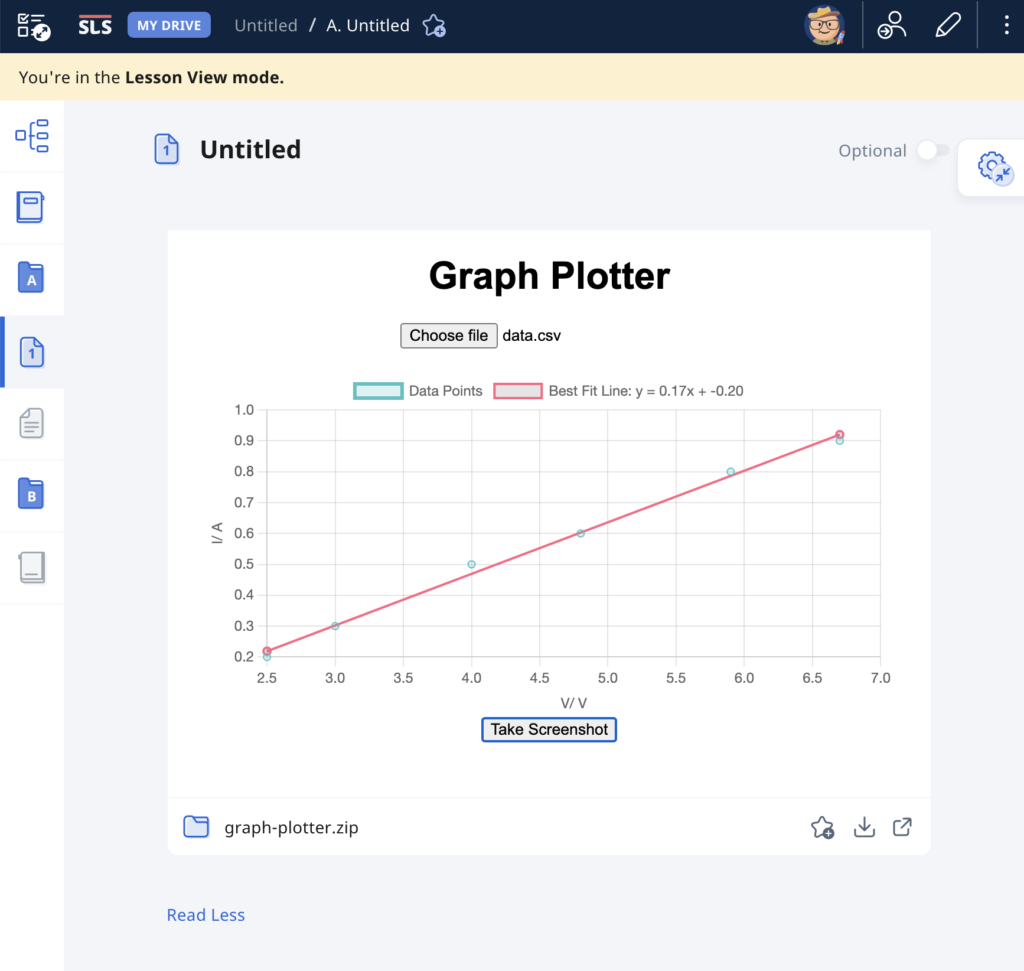
As evidence of the prowess of generative AI, this graph plotting app was created in about 15 minutes with simple prompts and a text editor. It was tested with an existing set of data and uploaded immediately to the repository.
The user will begin by uploading a set of data from an experiment, with the column header being the labels for the axes, in the form of a CSV file. The app immediately calculates and displays the best-fit straight line using linear regression, providing users with insights into the relationships between the variables in the dataset. This allows for easy analysis of trends, patterns, and relationships within the data. Students can use the app to quickly visualize and analyze data. The screenshot button enables them to save the graph in picture form for submission to their teachers.
It has also been made compatible with the Student Learning Space. The screenshots saved by students can be uploaded as an attachment for a free-response question. This is especially useful when students are doing lab work and the teacher does not want the students to bother too much with configuring the graph. The ZIP file for use in the SLS can be downloaded here.
Prompts used are:
Create a website using html and javascript for users to plot a graph using data from a csv file.
The user can upload a csv file with the first column being the horizontal axis and the second column being the vertical axis.
The column headers, which is the first set of values in the csv file, will form the labels for the axes of the graph.
Plot the points with the data in the csv file and use linear regression to obtain the best-fit straight line of the data.
The best fit line should be a line joining two red dots.
Indicate the gradient and intercept of the best-fit line.
Add a button at the bottom for users to take a screenshot of the graph.
A dice simulation is an excellent tool for teaching probability because it provides a hands-on, visual way for students to understand the concepts of probability through experimentation and observation.
In the simplest demonstration, students should be able to predict and observe that a fair six-sided dice gives equal probability of outcome and hence, almost equal total occurrences given a large-enough sample size.
Students can then be asked to predict the probability distribution if given two dice.
The good thing is that with simulations, students get to compare the experimental probabilities they calculated with the theoretical probabilities and discuss any discrepancies and reasons for them. This allows students to understand the concept of randomness and how experimental results may vary from theoretical expectations due to chance.
Click here to access the simulator and here to download it for SLS.
The prompts used for ChatGPT are as follow:
Provide the code for the following in a single html file:
Create a 6-sided dice simulator where the user can click on the image of a dice, the dice image will change randomly and the final result will be shown on the image.
The dice image will be represented by the file “dice1.png” for the number 1, “dice2.png” for number 2, “dice3.png” for number 3 and so on. The image size is 80 pixels by 80 pixels.
The default setting shows one dice. The initial image shown is “dice1.png”.
Create a button to cast the dice.
Create a bar chart with 6 vertical columns at the bottom that shows the frequency of the numbers obtained by the dice. Adjust the bar chart to show all 6 possible outcomes.
Each time the dice is cast and the result is shown, it is added to a list shown below the chart.
Create a button for an option to toggle between the use of one dice or two die. When this button is clicked, the list of results and the bar chart is cleared. The initial images shown are both “dice1.png”. If two die are used, both die will be shown side by side.
Both die will be cast when clicking on either dice. The bar chart now shows the frequency of the total of the numbers obtained by the die. Adjust the bar chart such that it now has 12 vertical columns show all 12 possible outcomes.
The total number for each toss will be shown in the list.